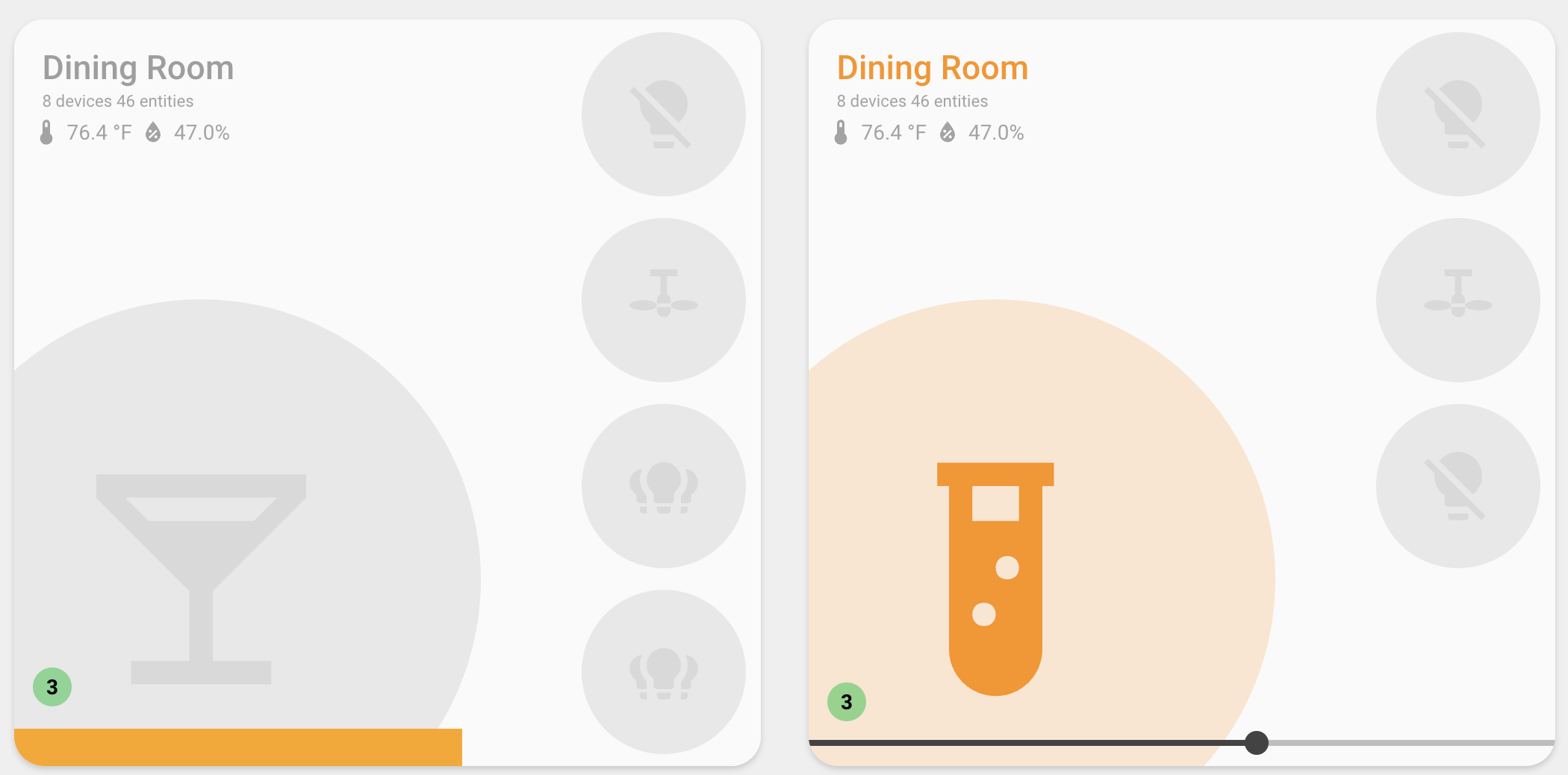
Slider Configuration
The card supports two independent slider concepts that will eventually merge. They are documented in the same page for now:
Horizontal Slider
A thin draggable strip that sits flush with the bottom edge of the
card. Opt-in at entity level with a slider config block — handy for input_number, number, and any other domain that supports set_value.
Basic setup
type: custom:room-summary-card
area: kitchen
entities:
  - entity_id: input_number.kitchen_brightness
    slider: {}
  - switch.kitchen_kettle
  - switch.kitchen_coffee
The first entity (scanning entity then entities) with a slider
block becomes the bound entity. Only one slider renders per card.
Supported domains
| Domain | Reads from | Writes via |
|---|---|---|
counter |
state + min/max/step |
counter.set_value |
input_number |
state + min/max/step |
input_number.set_value |
number |
state + min/max/step |
number.set_value |
media_player |
volume_level (0–1 → 0–100) |
media_player.volume_set (0–1) |
light |
brightness attribute (0–255) |
light.turn_on (brightness); light.turn_off at 0 |
For counter / input_number / number, the slider's range and step
are read straight from the entity's attributes. For media_player,
the slider is fixed to 0–100 and converted to/from volume_level. For
light, the slider is fixed to 0–255 and dragging to 0 turns the
light off.
Other domains (fans, covers, etc.) will be added as the two slider concepts merge.
Options
The slider block lives on an entity:
| Option | Type | Default | Description |
|---|---|---|---|
style |
'bar' / 'ha' |
'bar' |
Visual variant. bar is a chunky full-width strip; ha is the standard HA slider. |
hide_icon |
boolean | false |
When true, the entity is omitted from the icon grid — useful when it lives in entities. |
Hide the icon
When the slider entity is also in entities, set hide_icon: true so
it doesn't take up an icon slot. This allows you to control 6 entities at once:
type: custom:room-summary-card
area: kitchen
entity: switch.kitch_leds
entities:
  - entity_id: input_number.kitchen_brightness
    slider:
      style: bar
      hide_icon: true
  - switch.kitchen_kettle
  - switch.kitchen_coffee
  - switch.kitchen_under_cabinet
  - switch.kitchen_pendant
Light brightness
Bind the slider to a light's brightness. The slider exposes 0–255
and writes via light.turn_on (or light.turn_off when dragged to
0):
type: custom:room-summary-card
area: bedroom
entities:
  - entity_id: light.bedroom_ceiling
    slider:
      style: bar
      hide_icon: true
  - switch.bedroom_fan
  - switch.bedroom_lamp
Media player volume
Bind the slider to a media_player's volume_level. The slider
exposes 0–100 and writes back via media_player.volume_set for you:
type: custom:room-summary-card
area: living_room
entity: light.living_room
entities:
  - entity_id: media_player.living_room_speaker
    slider:
      style: bar
      hide_icon: true
  - switch.living_room_lamp
  - switch.living_room_fan
Theming
Three CSS variables let you tweak the look from styles: (or any
ancestor / theme):
| Variable | Controls | Default |
|---|---|---|
--user-slider-height |
strip height | 25px (bar), 3.5% (ha) |
--user-slider-track-color |
inactive track (use transparent) |
var(--disabled-color) |
--user-slider-bar-color |
active fill (the "bar") | var(--primary-color) |
Example — orange bar on a transparent track:
type: custom:room-summary-card
area: kitchen
entities:
  - entity_id: input_number.kitchen_brightness
    slider:
      style: bar
styles:
  card:
    --user-slider-track-color: transparent
    --user-slider-bar-color: orange
    --user-slider-height: 30px
Editor
The visual editor exposes the slider block as an expandable
"Slider" section under each entity, with style and hide_icon
fields.
Brightness Slider
The slider feature displays the first entity as a draggable vertical slider, allowing you to control brightness by dragging the entity icon up and down. This is particularly useful for light entities where you want quick brightness adjustment without opening a more-info dialog.
Basic Setup
Enable the slider feature and optionally configure the track style:
type: custom:room-summary-card
area: living_room
features:
  - slider
slider_style: minimalist
entity: light.living_room_main
Features
- Drag to Control: Drag the entity icon (or bar) vertically to adjust brightness (0-255)
- Visual Feedback: Icon position or bar fill reflects current brightness level
- Touch Support: Works with both mouse and touch interactions
- Multiple Styles: Choose from 14 different track visual styles
- Automatic Entity Selection: Uses the first entity from your entity list
- Color-Aware Bar Style: Bar style automatically uses the light's color for visual feedback
How It Works
When the slider feature is enabled:
- The card displays only the first entity as a draggable slider
- The entity icon can be dragged vertically along a track
- Dragging up increases brightness, dragging down decreases it
- The icon position reflects the current brightness level
- Other entities in the area are not displayed (only the slider entity)
Note: The slider works best with light entities that support brightness control. The brightness value (0-255) is mapped to the vertical position (0-100%).
Slider Styles
The slider_style option controls the visual appearance of the track. Choose from these options:
minimalist (Default)
Clean, minimal track with no visible elements:
track
Sunken track with depth and shadow effects:
line
Thin vertical line for a subtle appearance:
filled
Progress bar style that shows the current brightness level:
The filled area grows from bottom to top as brightness increases.
gradient
Gradient line effect with smooth color transitions:
dual-rail
Two parallel lines for a modern look:
dots
Dotted track with ticks at regular intervals:
notched
Track with notches/indents for tactile feedback:
grid
Grid pattern with horizontal lines for precise visual feedback:
glow
Glowing line effect using the primary color:
shadow-trail
Shadow that follows the icon position:
outlined
Outlined track border with transparent fill:
bar
Outlined bar filled with the light's color based on brightness level. The icon is hidden, and the entire bar is draggable. The fill color automatically matches the light's current color (RGB color, on_color, or theme color):
The bar fills from bottom to top as brightness increases, using the entity's color for visual feedback.
bar-filled
Outlined bar with proportional fill based on brightness level. Similar to bar, but the fill grows proportionally from bottom to top (0-100%) based on the brightness level, rather than always being fully filled. The icon is hidden, and the entire bar is draggable. The fill color automatically matches the light's current color (RGB color, on_color, or theme color):
The bar fill grows from bottom to top proportionally as brightness increases, using the entity's color for visual feedback. Unlike the bar style which always shows a full fill with a black line indicator, bar-filled uses the fill itself to indicate the brightness level.
Configuration Options
| Option | Type | Default | Description |
|---|---|---|---|
slider |
feature | Not enabled | Enable slider mode (add to features list) |
slider_style |
string | minimalist |
Visual style of the slider track |
Examples
Basic Slider
Simple slider with default minimalist style:
Slider with Filled Track
Progress bar style showing brightness level:
type: custom:room-summary-card
area: bedroom
features:
  - slider
slider_style: filled
entity: light.bedroom_ceiling
Slider with Glow Effect
Modern glowing track style:
type: custom:room-summary-card
area: office
features:
  - slider
slider_style: glow
entity: light.office_desk
Slider with Bar Style (No Icon)
Bar style with color fill - perfect for a clean, modern look:
type: custom:room-summary-card
area: living_room
features:
  - slider
slider_style: bar
entity: light.living_room_main
The bar automatically uses the light's color (RGB color, on_color, or theme color) for the fill.
Slider with Bar-Filled Style (Proportional Fill)
Bar-filled style with proportional color fill based on brightness level:
type: custom:room-summary-card
area: living_room
features:
  - slider
slider_style: bar-filled
entity: light.living_room_main
The bar fill grows proportionally from bottom to top based on brightness, automatically using the light's color (RGB color, on_color, or theme color).
Slider with Custom Entity Configuration
Configure the slider entity with custom icon and colors:
type: custom:room-summary-card
area: living_room
features:
  - slider
slider_style: gradient
entity:
  entity_id: light.living_room_main
  icon: mdi:ceiling-light
  on_color: warm_white
  off_color: grey
Slider with Background Image
Combine slider with background images:
type: custom:room-summary-card
area: bedroom
features:
  - slider
slider_style: filled
entity: light.bedroom_ceiling
background:
  image: /local/images/bedroom.jpg
  opacity: 30
Slider with Occupancy Detection
Combine slider with occupancy detection:
type: custom:room-summary-card
area: living_room
features:
  - slider
slider_style: shadow-trail
entity: light.living_room_main
occupancy:
  entities:
    - binary_sensor.living_room_motion
  card_border_color: '#4CAF50'
Entity Selection
The slider feature uses the first entity from your entity list. The entity selection follows this priority:
- Explicit
entityconfiguration - If you specify anentity, it will be used - First entity from
entitiesarray - If you have anentitiesarray, the first one is used - Auto-discovered room light - Falls back to the default room light entity
Important: When slider is enabled, only the first entity is displayed. Other entities in the area are not shown.
Interaction
Mouse/Trackpad
- Click and drag the entity icon up or down
- Release to set the brightness level
- The icon position updates in real-time as you drag
Touch
- Touch and drag the entity icon up or down
- Lift finger to set the brightness level
- Works on mobile devices and tablets
Brightness Mapping
The slider maps brightness values as follows:
- Top position (0%) = Maximum brightness (255)
- Bottom position (100%) = Minimum brightness (0)
- Middle position (50%) = Medium brightness (~128)
The icon position automatically updates when the entity brightness changes externally (e.g., from another control or automation).
Troubleshooting
Slider Not Appearing
If the slider doesn't appear:
- Verify
slideris in thefeatureslist - Check that you have at least one entity configured or auto-discovered
- Ensure the entity supports brightness control (light entities)
Brightness Not Changing
If dragging doesn't change brightness:
- Verify the entity supports brightness control
- Check that the entity is not in a locked or unavailable state
- Ensure you have proper permissions to control the entity
Wrong Entity Displayed
If the wrong entity is shown:
- Specify the desired entity explicitly using the
entityconfiguration - Ensure it's the first entity in your
entitiesarray if using multiple entities - Use
exclude_default_entitiesif you want to prevent auto-discovery
Style Not Applying
If the slider style doesn't change:
- Verify
slider_styleis spelled correctly (use hyphens, e.g.,shadow-trail) - Check that the
sliderfeature is enabled - Try refreshing the card or restarting Home Assistant
Best Practices
- Use with Light Entities: The slider works best with light entities that support brightness
- Choose Appropriate Style: Select a track style that matches your dashboard theme
- Combine with Other Features: Slider works well with background images and occupancy detection
- Consider Touch Users: The slider is great for touch dashboards where quick brightness control is needed
- Single Entity Focus: Remember that only one entity is displayed when slider is enabled
Limitations
- Only displays the first entity (other entities are hidden)
- Works best with light entities that support brightness
- Requires entities with brightness attribute (0-255 range)
- Touch interactions may be less precise on very small screens