Features
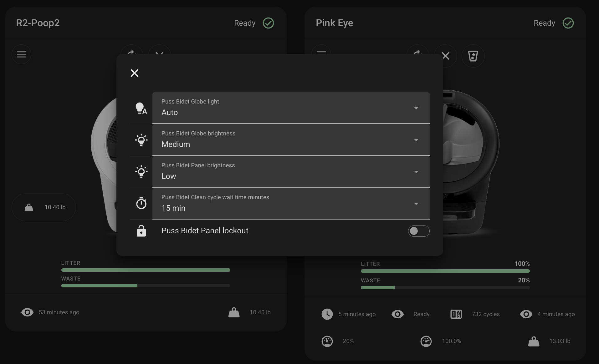
- Model-aware artwork — The card shows an image matching your robot, detected from the device's model and serial number (Litter-Robot 4, 5, 5 Pro, or Evo). A
coloroption picks white or black artwork (Configuration options). - Status header — Friendly title (device name or optional override), human-readable status text, and a colored status icon derived from the
status_codesensor. - Cycle styling — While the robot reports an active cycle (
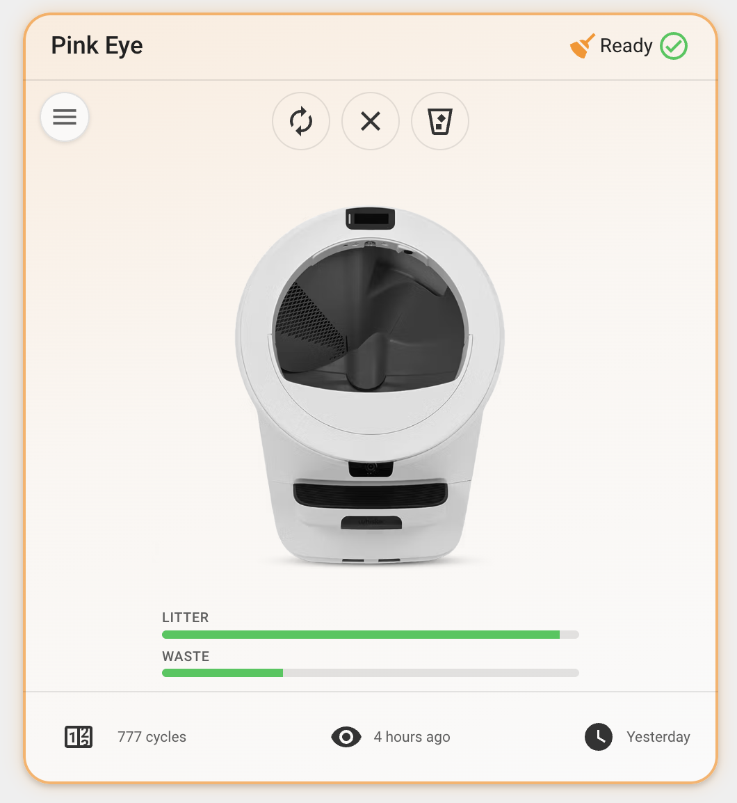
ccp,ec,cst), the card reflects cycling state for subtle visual emphasis. - Quick actions — Picture-style controls for the litter box vacuum and reset (see Interactions).
- Controls menu — A menu button opens a dialog with standard Lovelace entity rows for globe light, globe brightness, panel brightness, cycle delay, and panel lockout when those entities exist.
- Pet weight — Show the pet weight sensor by adding
pet_weightto the footer, or visualize trends with the pet weight graph below. - Pet weight graph — A pet weight graph below the gauges. Choose between Home Assistant's native history graph (live data) or statistics graph (long-term mean/min/max trends) via
graph_type. Per-cat weight sensors are auto-detected; use thechonkoption to choose sensors, set the time window, statistic types, chart style (line,line-stack,bar,bar-stack), or hide the graph (Pet weight graph). - Pet visits graph — A per-cat visits today graph below the weight graph, built from the integration's
visits_todaysensors (auto-detected). Because that sensor is a daily-resetting total, it defaults to a statistics graph plotting the total per period as stacked bars over a daily period — one bar per day, split by cat. Use thevisitsoption to choose sensors, switch to a history graph, adjust the window and chart style, or hide it (Pet visits graph). - Collapsible graphs — Each graph sits in its own titled, collapsible section, so you can fold either one away while browsing the card. Set
collapsed: trueto have a section start closed, keeping the card compact with the data one tap away (Collapsible sections). - Mini layout — Set
mini: truefor a compact, low-profile card showing just the name, status, and full-width litter/waste gauges — no artwork, controls, graphs, or footer. Built for wall-mount and small dashboards (Mini layout). - LitterHopper status — On Litter-Robot 4 with a LitterHopper attached, a header badge appears next to the robot status icon when the integration exposes hopper entities. You can also add Hopper status and Hopper connected to the footer (Footer configuration). Badge icons match the official
litterrobotintegration; colors follow your Home Assistant theme. - Cleaning reminder — Point the card at any on/off-style entity with
cleaning_entity; when it's active, amdi:broomheader badge and a warning-colored card glow (tinted background + border) appear, signalling the unit needs cleaning. Tap the badge for more-info. Great for a calendar-driven "needs cleaned" loop (Cleaning reminder).
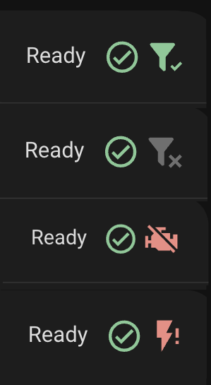
LitterHopper header badge
The badge combines hopper_connected and hopper_status. When the hopper is disconnected, that takes priority over status.
| Condition | Icon | Badge color |
|---|---|---|
Hopper disconnected (hopper_connected off) |
mdi:filter-remove |
Muted (gray) |
Connected, ready (hopper_status Enabled) |
mdi:filter-check |
Green |
Connected, needs refill (hopper_status Empty) |
mdi:filter-minus-outline |
Orange |
| Connected, disabled | mdi:filter-remove |
Gray |
| Motor disconnected | mdi:engine-off |
Red |
| Motor fault (short) | mdi:flash-off |
Red |
| Motor over-current | mdi:flash-alert |
Red |
| Status unknown or unavailable | mdi:filter |
Muted (gray) |
Tap the badge to open the hopper status more-info dialog (or the connected entity when status is missing).
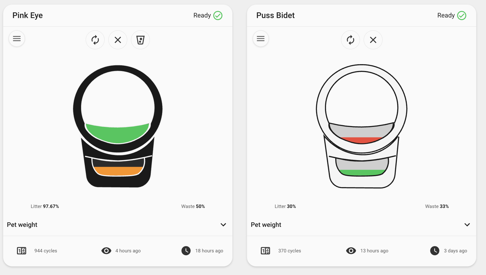
- Litter and waste gauges — Visual fill levels; waste styling reflects severity as the drawer fills. Optionally show fill percentages, or switch to illustrated levels that replace the marketing image and bars with litter/waste zones that fill in proportion to their level and color by severity (Feature flags).
- Customizable footer — Choose which device metrics appear in the card footer (Footer configuration). Defaults to total cycles, status last changed, and last seen.